Sales · 20 July 2026 · 12 min read
20 Best Performing Book Demo Pages (Real Examples + Screenshots)
We analysed 20 of the highest-converting 'Book a Demo' pages across B2B SaaS. Here's what the best ones do — with real screenshots and teardowns.
Most B2B companies spend weeks obsessing over their homepage hero, their pricing page, even their 404 page — and then spend about 20 minutes on the one page where actual money gets made. Their "Book a Demo" page.
Here's the uncomfortable truth: the average B2B demo request form converts at around 2% of visitors. The best ones convert at 8% or higher. That gap is not a design gap or a brand gap — it's a thinking gap. The companies at the top of this list thought very carefully about what a high-intent buyer actually needs at the exact moment they're deciding whether to raise their hand.
We went through 20 of the best-performing "Book a Demo" pages in B2B SaaS — companies known for high inbound conversion rates — and broke down exactly what each one does well. Buckle up.
The numbers behind the page everyone ignores
Before we get to the teardowns, a few industry facts that explain why this page matters more than people think:
- Responding to a demo request within 5 minutes makes you 100x more likely to connect with the lead than responding 30 minutes later, according to research published in the Harvard Business Review. Most teams respond in 47 hours.
- Adding a single unnecessary field to a form reduces conversion by roughly 10% per extra field. The average B2B demo form has nine fields. The best ones have four.
- Social proof placed near a form CTA increases conversion by up to 34%. Most teams bury their customer logos at the bottom of the page, well below the fold.
- 67% of B2B buyers prefer to do most of their research before speaking to sales (Forrester). They arrive at your demo page having already made a provisional decision. Your job is not to convince them — it's to not un-convince them.
- Conversational forms achieve 3 to 4x higher completion rates than static multi-field forms. The data is consistent across dozens of studies.
- 48% of demo requests never receive a follow-up at all. In other words, nearly half the leads who raised their hand were just left standing in the rain. (Drift, State of Conversational Marketing)
With that context in mind, here's what the best teams are actually doing.
What separates a great demo page from an average one
Across all 20 pages, the best ones share exactly four traits. They make a specific promise about what happens in the demo — not "see our product" but "see how teams like yours reduced churn by 22%." They reduce friction without removing qualification. They build trust at the exact moment doubt is highest (right next to the submit button). And they tell you what happens next, so booking a demo feels like the start of something rather than a leap into the unknown.
The worst demo pages do the opposite of all four. Let's look at what it looks like when a company gets it right.
1. Gong — Social proof before you read a single word
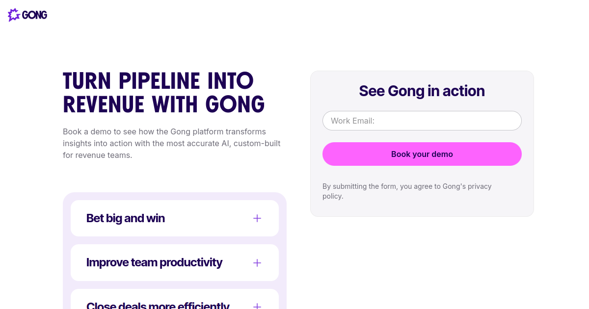
Gong's demo page is quietly brilliant in a way most people miss. Before you read the headline, before you read the subheadline, your eye catches a G2 badge, a star rating, and a customer count. By the time you're reading the actual copy, your brain has already been told "thousands of revenue teams already trust this." The page has done its hardest job before the prospect reads a word.
Gong also coined the category name "Revenue Intelligence," which is doing significant work on this page. Positioning yourself as a category, not a product, means prospects arrive pre-qualified — they already know what revenue intelligence is and they're here because they want it.
- G2 badge above the fold — social proof before the ask, not below it
- Category language — "Revenue Intelligence" owns the space rather than listing features
- Role dropdown on the form — filters leads without adding friction; a VP Sales and an SDR manager get different demo flows
2. HubSpot — The form that already knows who you are
HubSpot has an obvious advantage: they built the CRM, so they know who's already in it. Their demo page uses progressive profiling — if your email is already in HubSpot's own database, the form shortens or pre-fills. Fields you've answered before simply don't appear. For anyone who's ever interacted with HubSpot content, the form might be just one or two fields.
This is a significant conversion advantage. It also demonstrates the product's capability in real time: "Yes, we already know who you are. That's what our software does." The headline is outcome-focused ("See how HubSpot can help your business grow") rather than task-focused ("Book a 30-minute demo"), which is a small but meaningful difference.
- Progressive profiling — fewer fields for anyone already in HubSpot's CRM
- Outcome-led headline — "help your business grow," not "schedule a call"
- Free trial alternative — captures prospects not ready for a sales conversation
3. Salesforce — Let the logos do the talking

Salesforce does not need to tell you it's a serious product. Amazon uses it. Toyota uses it. NBCUniversal uses it. The logos on this page are doing all the convincing, and Salesforce knows it — they're placed prominently, at scale, before the form. The message isn't "here's our list of features." It's "companies you already respect made this same decision before you."
The form itself is deliberately sparse: six fields, enough to route the lead to the right product team, nothing more. No hidden fields, no long dropdowns, no "how did you hear about us." For a company with hundreds of products, that restraint is notable.
- Fortune 500 logos front and centre — trust by association at enterprise scale
- Six-field form — minimal but sufficient for routing to the right cloud product
- Multiple product paths — Sales Cloud, Service Cloud, and Marketing Cloud each have dedicated demo flows
4. Outreach — "Here's exactly what happens when you click submit"
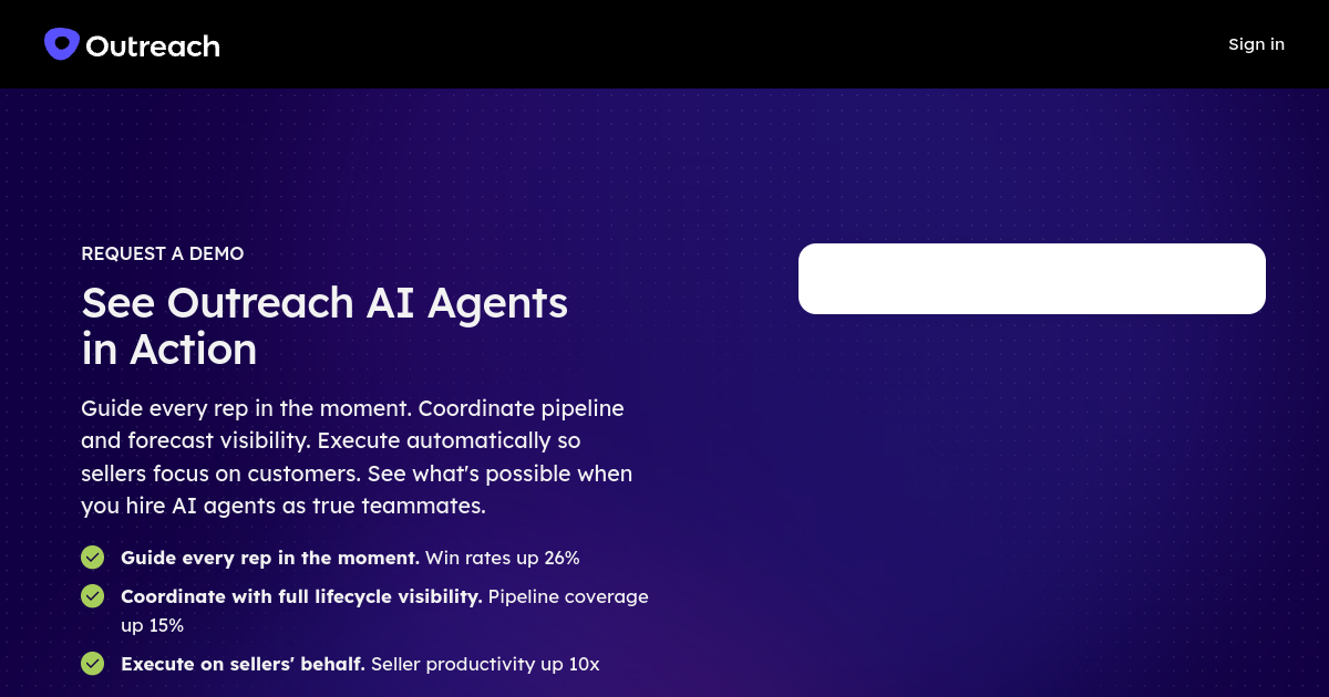
Most demo pages are vague about what happens after you submit. Outreach is refreshingly explicit: "One of our team members will reach out within one business day." That's a commitment, not a platitude. And it matters — a lot of form abandonment happens not because the prospect doesn't want the product, but because they're anxious about what they're signing up for.
Outreach also includes photos of actual SDRs on the page, which is a subtle but effective humanising move. You're not submitting a form into the void. You can see the face of the person who's going to email you.
- Explicit SLA above the form — "within one business day" removes post-submit anxiety
- SDR photos — real faces make the follow-up feel personal, not automated
- Product preview video — primes the prospect so the demo call is shorter and sharper
5. Drift (Salesloft) — When your demo page is also a product demo

Drift built one of the most famous demo pages in B2B SaaS by doing something audaciously self-referential: they used their own conversational marketing product to handle every demo request. A chatbot asks two or three qualifying questions — role, company size, use case — before routing you to either a form, a calendar, or a live rep. The entire experience is their product in action.
This is product-led trust at its best. You're not being told Drift is good at conversational qualification. You're experiencing conversational qualification. By the time you've finished the flow, you've already had a better experience than you'd get filling in a static form anywhere else, and your first impression of the product is that it works.
- Bot-first qualification — two or three conversational questions before the ask
- Live rep handoff when available — high-intent prospects can skip the queue entirely
- Meta product proof — experiencing the demo request flow is itself the product demonstration
6. Monday.com — No waiting, here's the calendar
Monday.com's demo flow has a clever twist: once you submit the form, a calendar appears immediately on the same page. There's no waiting for a rep to review your submission and send a Calendly link two hours later. If you meet the qualification bar, you book the meeting right now, while you're still in the mindset that brought you to the page in the first place.
This matters because of a very well-documented phenomenon in sales: lead intent decays rapidly with time. A prospect who was ready to buy at 2pm on Tuesday is a different prospect at 4pm on Wednesday after two meetings, a fire drill, and someone else's product demo. Monday.com doesn't give that gap a chance to open.
- Immediate calendar after form submission — no confirmation email, no waiting for a rep
- Team size qualifier — SMB and enterprise routes to different calendar pools
- UI screenshots on the page — sets visual expectations before anyone shows up to the call
7. Intercom — "This demo is about your company, not ours"
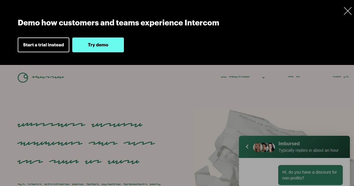
Intercom frames the demo as a personalised experience — not "let us show you the product" but "let us show you the product in the context of your specific business." This is a meaningful framing shift. A demo customised for my company's support workflows is worth 45 minutes of my time. A generic product walkthrough is not worth 20.
Notably, Intercom also places their own Messenger widget on the demo page, which is the most direct product demonstration possible: the messenger you're being asked to consider is literally available for you to use right now, on this page, to ask a question. The proof of value is in the interface.
- Personalisation promise — "tailored to your business" rather than "product overview"
- Use-case routing — support, marketing, and product teams get routed to relevant specialists
- Live Messenger on the demo page — immediate product demonstration without a sales call
8. Apollo.io — Four fields, enormous promise
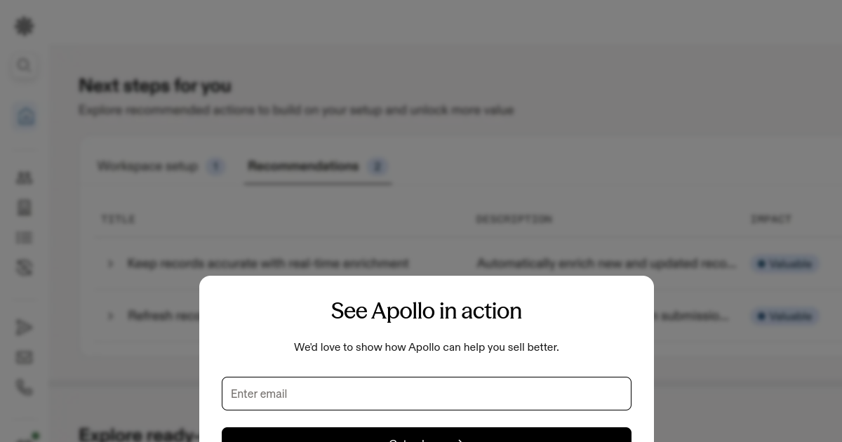
Apollo's demo page is a lesson in sequencing: lead with the value, then ask for the commitment. Before the form appears, you've been told there are 275 million contacts available, with verified emails and direct dials. By the time you're looking at the four-field form, you're already mentally spending the budget. This is the right order of operations. Most demo pages do it backwards: form first, value proposition somewhere further down the page.
Apollo also offers a free trial as an alternative CTA — a smart escape valve for prospects who want access to the data but aren't ready for a sales conversation yet. Those prospects often convert to paid faster than the ones who went through the demo flow.
- Specific data claim above the fold — 275M+ contacts makes the value concrete before the ask
- Four-field form — among the lowest friction on this entire list
- Free trial CTA alongside demo — captures the self-serve segment without abandoning them
9. Clari — Lead with the nightmare, not the product
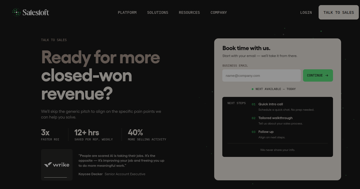
Clari opens with "Stop revenue leak" — and that three-word headline does more heavy lifting than most demo pages manage in three paragraphs. Revenue operations leaders who visit this page don't need to be told what Clari does. They need to see that Clari understands what they lose sleep over. Naming the specific fear converts better than describing the specific feature.
The form includes a question about CRM platform — Salesforce users and HubSpot users get routed to different product specialists who can speak credibly to each environment. Forrester and Gartner analyst quotes sit alongside the customer logos, which adds credibility beyond peer review.
- Pain-led headline — "stop revenue leak" rather than "revenue forecasting software"
- CRM routing — Salesforce vs HubSpot routes to a specialist who knows your setup
- Analyst validation — Forrester and Gartner quotes alongside G2 and customer logos
10. Gainsight — Speak the economic buyer's language
Gainsight's demo page leads with net revenue retention — a metric that only one person in most companies really owns: the VP of Customer Success who writes the renewal report for the board. By putting NRR improvement data above the fold, Gainsight is signalling clearly who this page is for. A director of customer success who sees that headline knows this product was built for them, not for a generic "business" user.
The form asks for team size and which CS tool you're currently using. Those two questions tell Gainsight whether you have budget and how ready you are to switch — the two things a well-prepared AE needs before a first call.
- NRR metric above the fold — addresses the economic buyer directly
- Current tool question — reveals switching intent and competitive position before the call
- G2 category leader badge — third-party credibility in a market with strong alternatives
11. Calendly — The most self-referential demo page in SaaS
Calendly's demo page might be the most famous example of product-led trust in all of B2B SaaS. To book a demo of Calendly, you use Calendly. An embedded Calendly scheduler sits on the page. You pick a time. No form at all. The implicit message is hard to beat: "Our product is so good that this is how we run our own sales process."
It's a bold statement because it puts the product's credibility on the line publicly. If Calendly's own booking experience were clunky or confusing, the demo page would be doing active damage. The fact that it's polished and fast is itself the strongest marketing message the company could send.
- Embedded Calendly scheduler — no form, no friction, just pick a time
- Product-as-proof — booking a Calendly demo with Calendly is the most concise possible pitch
- Enterprise logos panel — Lyft, Dropbox, Twilio signal the right ICP tier
12. Asana — Honest enough to send you away

Asana does something unusual: they explicitly gate the sales path by team size. Teams under a certain threshold are redirected to the self-serve free plan rather than a sales call. This is either very honest or very confident — and probably both. It removes the awkward dance where a sales rep has to tell a 3-person team that enterprise pricing doesn't make sense for them.
For teams that do qualify, the page is clean and direct. The SLA is explicit ("A member of our team will reach out within 24 hours"), the value proposition is one sentence, and the form is short. Asana has essentially decided that being ruthlessly efficient for the right customer is better than being politely vague for everyone.
- Hard team-size gate — small teams routed to self-serve, not to a sales rep who'll have to say no
- One-sentence value prop — no jargon, no feature list, no preamble
- 24-hour response SLA — explicit commitment, not vague language like "we'll be in touch"
13. Miro — The page feels like the product
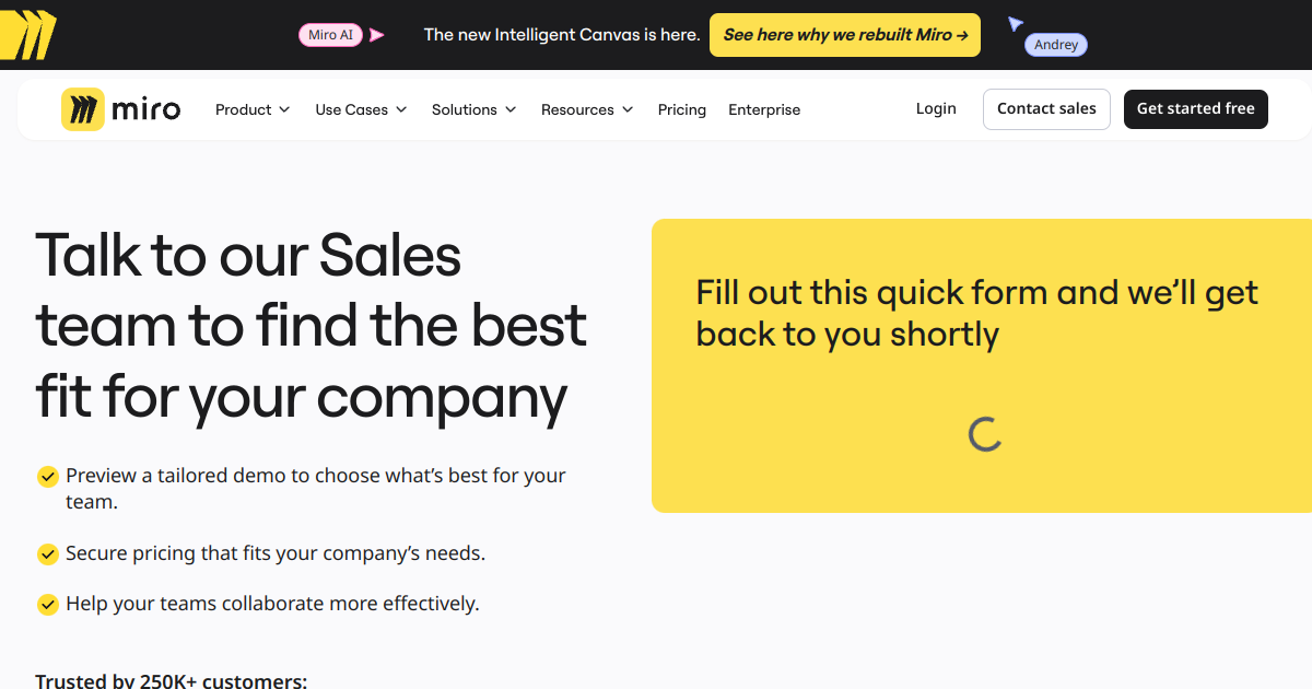
Miro's demo page is visually energetic in a way that most corporate B2B pages are not. Bold colours, a dynamic layout, a sense of movement. It feels like the product. This is important because Miro's core value proposition is that collaboration should feel good — and the demo page is your first experience of that. A grey, static, form-heavy page would undermine the brand before the demo even happened.
The form routes by use case: agile teams, design teams, and strategy teams get sent to different specialists who've prepared relevant demo templates for each workflow. You're not getting a generic walkthrough of the toolbar.
- Brand-consistent visual energy — the page feels like Miro before you've opened Miro
- Use-case routing — agile, design, and strategy each go to a specialist
- Outcome statements — "faster workshops," "better remote alignment" rather than feature lists
14. Figma — Know who's actually buying
Figma's enterprise demo page is a clinic in audience awareness. The designer who uses Figma every day already loves it. They're not the one you need to convince for an enterprise contract. The person you need to convince is in IT and procurement. So Figma's enterprise demo page leads with SSO, advanced admin controls, and security compliance certifications — not design features. It reads like a procurement brief, not a product brochure.
The form asks for company size, role, and current design tool. Together, those three answers tell the AE: how big is the deal, who am I talking to, and are we displacing Sketch or InVision (both of which have specific migration stories Figma can tell).
- IT/security-first copy — written for procurement, not for the designer who already loves the product
- Current tool question — migration-focused demo for Sketch and InVision teams
- SOC 2 and GDPR compliance badges — enterprise objections addressed before the question is asked
15. Typeform — Meta-proof at its finest
Typeform's demo request flow uses a Typeform. One question at a time, conversational, on-brand. Like Calendly, the entire premise is self-referential: you're experiencing the product while requesting access to it. By the time you've answered six questions and hit submit, you've already had a positive experience with Typeform's core UX. You arrive at the demo call with expectations already set correctly — and they were set well.
There's also a conversion benefit here that goes beyond the meta-proof angle. Conversational one-question-at-a-time flows achieve completion rates 3 to 4 times higher than static multi-field forms. For a demo request page where every completion has real commercial value, that difference compounds quickly.
- Demo request built in Typeform — product-led proof in the most direct way possible
- Conversational format — 3 to 4x higher completion rates than a static form
- Answer-shaped follow-up — responses customise the email sequence before the call
16. Notion — Enterprise is a completely different product
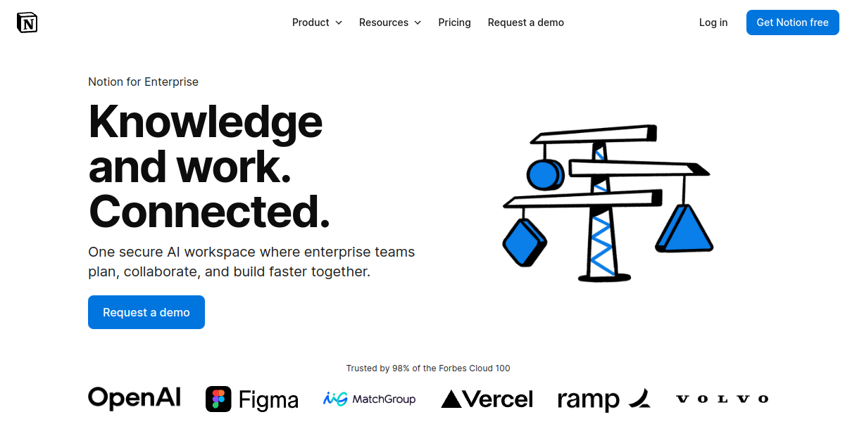
Notion's consumer homepage is minimal and aspirational. Notion's enterprise demo page looks like a different company made it. SOC 2 certification, HIPAA compliance, GDPR controls, audit logs, advanced permissions — that's the opening pitch. This is deliberate and right: the person making the call on a 500-seat Notion Enterprise contract is a CIO or IT director, not the knowledge worker who's been using the free tier for their personal notes.
Notion runs separate demo flows for different buyer types — IT admins, department heads, and executives each follow a different path. Nobody gets a demo that wasn't designed for them. At scale, that specificity is a significant conversion advantage.
- Compliance-first messaging — SOC 2, HIPAA, GDPR upfront for the enterprise buyer
- Separate flows by buyer type — IT admins, executives, and department heads each get relevant demos
- Seat-count qualifier — routes to the right AE based on deployment size
17. Loom — "Watch 2 minutes before you commit to 30"

Loom's enterprise page opens with a short embedded Loom video — a two-minute product overview you can watch before deciding whether to book. This is a clever inversion of the usual dynamic: instead of asking for 30 minutes of commitment upfront, Loom offers you 2 minutes of value first. The deal is asymmetric in your favour, which makes the ask feel lower-stakes.
There's also a qualification benefit: prospects who watch the full overview arrive at the form with a much clearer sense of whether the product fits. They've pre-qualified themselves. The form submissions that follow are higher intent, better informed, and faster to close. And yes, the fact that the video is a Loom is the whole point — async-first product, async-first demo process.
- 2-minute video before the form — lowers the commitment barrier significantly
- Video as a self-qualifier — prospects who watch are materially higher intent
- Async-first brand consistency — using Loom to sell Loom is the entire argument in one gesture
18. Chili Piper — What if the demo page was the product?

Chili Piper sells speed-to-lead software — the argument being that connecting with a prospect within minutes of their form submission dramatically increases conversion. Their own demo page is built to prove that claim. You fill in a short form, and a calendar appears on the same screen, immediately. No confirmation email. No "we'll be in touch." No 24-hour SLA. Right now.
Research suggests that contacting a lead within 5 minutes makes you 100x more likely to connect compared to waiting 30 minutes. Chili Piper knows this better than anyone — it's literally their product thesis — so their demo page is built around it as a live demonstration. The headline is "Book time with us. Right now." Not a suggestion. A statement.
- Calendar on the same screen after form submit — the product promise made literal
- "Right now" messaging — no softening language, no ambiguity about timing
- Speed-to-lead as proof — your first experience of Chili Piper is instant booking; that's the entire pitch
19. ZoomInfo — The form that fills itself
ZoomInfo uses its own data enrichment product on its demo request form. As you type your work email address, the form pre-fills your company name, industry, and employee count from ZoomInfo's own database. You're submitting fewer fields because ZoomInfo already knows the answers. It's a time-saver, yes — but more importantly, it's a product demonstration so seamless it barely registers as one.
The page also personalises the headline based on industry segment — a financial services visitor sees different copy from a technology visitor. This kind of intent-data-driven personalisation is the core ZoomInfo product promise, and the demo page uses it on itself.
- Auto-fill from own database — type your email, watch the form complete itself
- Industry-personalised headline — different copy for tech, finance, and healthcare segments
- Intent signals surfaced on-page — shows existing ZoomInfo contacts at your company, making the database feel real
20. Clearbit — Your company name in the headline
Before Clearbit was acquired by HubSpot, their demo page ran what became one of the most cited conversion experiments in B2B growth marketing. Using their own reverse-IP lookup, they personalised the page headline in real time based on the visitor's company. If you arrived from a Shopify IP block, the headline read something like "See how Shopify-scale teams use Clearbit." If you came from a healthcare company, the healthcare version appeared. No login required, no form to fill. The page just knew who you were.
The result: conversion rates for personalised visitors were more than double those of the un-personalised control group. The experiment became famous enough that "Clearbit personalisation" entered the B2B growth lexicon as shorthand for IP-based demo page personalisation. It's now table stakes at the top end of the market.
- Reverse-IP headline personalisation — company name in the headline more than doubled conversion
- Firmographic auto-routing — company size from IP data determines AE assignment before the form is submitted
- Form field reduction — IP enrichment fills company fields, leaving email as the only required input
What all 20 pages have in common
Looking across these pages, the pattern is consistent. Every one of them treats the demo request not as a form to fill in but as a product experience to begin. The form is one component — but the social proof, the outcome promise, the next-step transparency, and the qualification logic contribute just as much to whether someone completes the flow.
The worst demo pages — and there are a lot of them — do the opposite. They ask for a 30-minute meeting without explaining what the meeting covers, who the prospect will speak to, what problem will be solved, or what happens after they click submit. Those pages convert at 1 to 2%. The pages above convert at 5 to 10%.
That gap is not attributable to design budget or brand recognition. It's attributable to thinking.
The five things every high-converting demo page gets right
- A specific outcome promise — not "see the product" but "see how teams like yours reduced X by Y%." Vague value propositions produce vague interest.
- Social proof near the form — not at the bottom of the page, but adjacent to the submit button where doubt is highest. Research consistently shows 15 to 34% lift from this placement alone.
- Qualification without friction — 4 to 6 smart questions that route the lead correctly, rather than a 12-field interrogation that feels like a job application.
- Next-step clarity — explicit information about who will contact you, when, and what the call will cover. Ambiguity kills completion rates.
- Speed to calendar — the fewer steps between form submission and a scheduled meeting, the higher the eventual show rate. Intent decays fast.
How to build one that actually works
If you're rebuilding your demo request flow, don't start with the design. Start with qualification logic. The companies above don't route every form submission to a sales rep's calendar — they qualify first and route based on the answer. A VP of Engineering at a 200-person company gets one experience. A solo founder kicking the tyres gets another. Both experiences can be good, but they can't be the same experience.
For most B2B SaaS teams, 4 to 5 qualifying questions with scoring logic is enough to separate high-value leads from unqualified enquiries. HuperForms was built specifically for this — a form that scores answers in real time and routes to a different outcome based on the total. Top leads go straight to a calendar link. Mid-tier leads get a resource or a self-serve option. Low-fit submissions get a polite decline rather than a wasted sales call that neither side wanted.
The best demo page you can build is one where a high-fit prospect completes it in under 90 seconds and books a meeting immediately. And a low-fit prospect is redirected gracefully rather than handed to a rep who'll spend 30 minutes figuring out there's no deal to be done.
Frequently asked questions
What is a good conversion rate for a "Book a Demo" page?
The average B2B demo request page converts between 1 and 3% of visitors. Best-in-class pages — using the techniques in this list — convert at 5 to 8%. If you're below 2%, the most likely culprits are form length, unclear value proposition, or no visible social proof near the submit button.
How many fields should a demo request form have?
Four to six fields is the sweet spot for most B2B SaaS companies. You need enough information to qualify the lead and route them correctly — typically work email, company, role, and one or two qualifying questions. Every field beyond six costs you conversion. Research shows approximately 10% lower completion rate per additional field above the minimum.
Should I use a calendar embed or a form on my demo page?
It depends on your sales model. A calendar embed (Calendly-style) removes friction and increases bookings, but you lose the ability to qualify before scheduling. A form-first approach qualifies the lead before they get calendar access, which improves show rates and meeting quality — but requires faster follow-up. The winning combination, used by Monday.com and Chili Piper among others, is a short qualifying form that immediately reveals a calendar for qualified leads.
Where should social proof go on a demo request page?
Adjacent to the form — not at the bottom of the page. Research from Trustpilot and various CRO studies consistently shows that social proof (logos, review badges, customer quotes) placed near the primary CTA increases conversion by 15 to 34%. The moment of highest doubt is right before someone clicks submit. That's where social proof does its most effective work.
How quickly should I follow up on a demo request?
Within five minutes, if possible. Research published in the Harvard Business Review found that companies contacting inbound leads within five minutes are 100 times more likely to connect with them than companies that wait 30 minutes. The ideal response is an immediate calendar link delivered automatically — no manual rep review required. If your process requires human review before sending a calendar link, aim for under one hour. Under 24 hours is the minimum standard.
What questions should I ask on a demo request form?
The most useful questions are those that (a) qualify deal size or fit, and (b) help route the lead to the right person or resource. Typically: work email (identifies company), company size or team size (qualifies budget), role or job title (identifies buyer type), and one use-case question (routes to the right specialist). You can also ask which tool they're currently using — this tells you whether there's a competitive displacement story to tell. Avoid vanity questions like "how did you hear about us" unless your marketing team genuinely uses that data.
Do conversational forms (like Typeform) really convert better than standard forms?
Yes, consistently and significantly. Conversational one-question-at-a-time flows achieve 3 to 4 times higher completion rates than static multi-field forms across most studies and published experiments. The psychological mechanism is the foot-in-the-door effect: once someone answers the first question, they're much more likely to answer the second, then the third. A standard 6-field form presents the full commitment upfront; a conversational flow reveals it gradually. The latter converts better every time.
What's the one change that will have the biggest impact on my demo page?
Add explicit next-step clarity immediately below the submit button. Tell people exactly who will contact them, when, and what the call will cover. Most demo pages say nothing about what happens after submission. Adding one sentence — "Our sales team will email you within 4 hours to schedule a 25-minute product walkthrough tailored to your use case" — removes the single biggest source of hesitation at the point of highest intent. It costs nothing to add and consistently lifts completion rates.